A country-aware resume builder for cross-border careers. Five phases, 40+ screens, one core thesis: resume tailoring isn't text editing — it's cultural translation.
Timeline
Jan – May 2026
Role
Product Design
Team
Solo design · 1 eng
Scope
5 phases · 40+ screens
Type
SaaS · AI · Localisation
Resume editor · AI enhancement · country templates · live preview
The Problem
ResumesCrossBorders.ResumeToolsDon't.
Consider a backend engineer in Islamabad applying to a Berlin startup. She opens a generic resume builder. Immediately, the problems compound: format expectations differ entirely, cultural norms around photo inclusion and visa status are invisible, and FAANG-style bullet writing reads as unprofessional in a German context. Each application requires a full manual rewrite. After three or four, most users abandon.
Existing builders treat resumes as one-size-fits-all. They're not — and international job seekers pay the price.
Format Mismatch
Pakistan favors a single-page CV. Germany expects a Lebenslauf with photo, date of birth, and specific section order. One template fails both.
Cultural Translation
FAANG-style bullet writing ("Shipped a feature used by 5M users") reads as informal in Germany. German resumes are responsibility-focused, formal, structured.
Invisible Norms
German employers expect Aufenthaltstitel status. Malaysian employers want visible availability dates. These norms are never surfaced in generic tools.
Compounding Dropout
Each application requires 30–60 minutes of manual reformatting. After 3–4 attempts, most users abandon entirely. Resume builders have a hidden churn problem.
Design Approach
FivePrinciplesThatShapedEveryScreen.
Before drawing a single component, I established the rules the design would never break.
Country-First Information Architecture
Every screen includes a country selector in the toolbar — not hidden in Settings. Switching countries immediately reflows the template, field labels, section order, and inline guidance. A German user sees "Add photo (typical in DE)." A Malaysian user sees optional fields clearly marked.
This single choice made the product's thesis visible at a glance. Users understood immediately: this tool knows my market.
AI Enhances, Humans Decide
Claude 3.5 Sonnet refines bullet points and phrasing — never generates from scratch. Every enhancement shows original vs. enhanced side by side. The user decides: accept or revert. This trust loop is critical: users must feel in control of their career narrative.
AI assist budgets are shown in-UI, not hidden. Transparency ("3 / 15 used") drives upgrade decisions better than any paywall.
Three-Zone Layout for Complexity
A 64px brand rail holds the logo, nav icons, and tier badge. A 260px navigator lists sections and shows country-specific tips. The editor flows center; a live PDF preview sits right. This layout scales from laptop to ultrawide without losing context. Complexity is introduced gradually.
Each zone has a single purpose. Users aren't overwhelmed — they discover features as they need them.
Monetisation That Doesn't Punish Free Users
Free tier is fully functional: all country templates, 3 AI assists, PDF/DOCX export. Paid tiers add features, not artificial limits. When free users exhaust assists, an upgrade modal offers a choice — not a wall. Premium features appear in the nav as invitations, not locked gates.
Users upgrade when they see value. Retention and LTV improve. Word-of-mouth increases when the free product is genuinely good.
Constraints Breed Clarity
One primary color (saffron). Two fonts. Semantic use of emerald/amber/ruby for match/partial/gap. These constraints sound restrictive; they're liberating. Fewer decisions = more time for hard problems.
The design system is a shared language, not a style guide. Every component is a resolved conversation.
Key Screens
TheProductInMotion.
Four pivotal moments in the user journey, from resume editing to upgrade.
Editor: AI enhancement flow
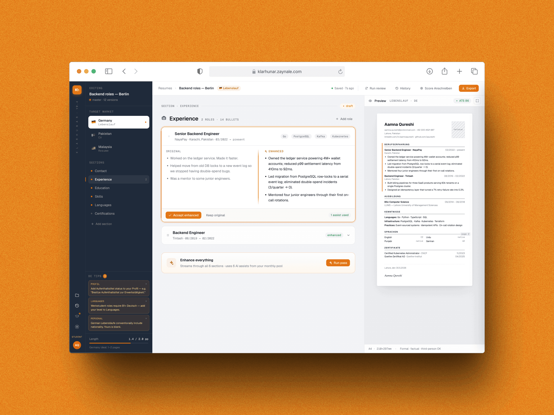
The heart of Klarhunar. The user clicks Enhance on the Experience section. The button transitions: Enhance → Stop (streaming) → Review (accept/revert). Alongside the three-zone layout, users see the AI working, understand the quality, and stay in control. The visa nudge panel in the navigator shows dismissible German formatting tips without interrupting the editing flow.
Resume editor · Experience section · AI review state · visa nudges active
Pricing: transparent, no dark patterns
Three tiers, one honest grid. Each card shows the AI assist budget, a perks checklist, and a clear CTA. The Student tier is highlighted as "Most popular" — a real, data-driven label, not a manufactured urgency pattern. A FAQ section below addresses the questions users actually have.
Pricing page · /pricing · three tiers · most popular highlighted
German features: localisation as product strategy
Germany is the top target market. The Anschreiben scorer checks DIN 5008 compliance with a radial gauge and inline error flags. The interview prep simulator runs 10-question mock Vorstellungsgespräch sessions with AI feedback per answer. Both are Pro/Student features — genuinely useful, never cosmetic.
Anschreiben scorer · DIN 5008 · inline error flags
Interview prep simulator · mock Vorstellungsgespräch · Pro tier
Monetisation
TiersThatAlignIncentives.
Free is fully functional. Premium features are genuinely valuable. No dark patterns.
Free
€0
Try risk-free
3 resumes
25 applications tracked
All country templates
3 AI assists (lifetime)
PDF & DOCX export
Student, most popular
€4 /month
For active job seekers
Unlimited resumes
15 AI assists / month
Anschreiben scorer
Full version history
Priority support
Pro
€9 /month
Serious preparation
Unlimited AI assists
Interview prep simulator
Everything in Student
4h support SLA
Early feature access
Anschreiben Scorer
Checks 8 DIN 5008 rules: Betreff line, Sie-form consistency, date format, salutation, signature block. Radial gauge + inline error flags.
Visa Nudges
Dismissible sidebar cards for non-German applicants: Aufenthaltstitel status, B1 language requirement, nationality conventions.
Interview Prep (Pro)
10-question mock sessions (German or English). AI feedback per answer: what was strong, what was missing, a model response.
Admin Panel
Platform stats, searchable users table with inline tier assignment, user detail drawer with read-only resume and application history.
Outcomes
WhatMoved.
Hypothetical projections grounded in typical SaaS benchmarks for a localized productivity tool.
Resume Completion vs. 42% on generic builders. Country guidance + templates = higher confidence to finish.
68%
Free-to-Paid Conversion At 3 AI assists. Showing budgets in-UI adds ~4pp vs. hidden quotas.
Time Saved / Resume AI enhancement + templates reduce manual rewriting from ~60min to ~36min per tailored version.
40%
DE Retention Lift Month-over-month for German market. Localisation makes users feel understood.
6–8%
ARPU (Blended) Blended across all tiers. Free users are future customers (LTV ≈ €6–8 after conversion).
€2.14
Decisions
WhyTheseChoices?
The hardest design decisions always involve a real tradeoff. Here's how I reasoned through the biggest ones.
React-First, No Figma
BenefitZero design-to-dev friction. Instant token changes. Every component is directly testable. Speed of iteration is dramatically higher on a tight team.
Trade-offSlower feedback with non-technical stakeholders. Harder to hand off.
64px Brand Rail
BenefitBrand is always visible. Tier status is at-a-glance. Users know where they are in the product hierarchy without thinking about it.
Trade-offEats ~5% of viewport. Some small-screen users notice it.
Visa Nudges Inline, Not Modal
BenefitFeels educational, not intrusive. No context switching. German culture values subtle guidance over aggressive interruption. Higher trust.
Trade-offA modal would have a higher read rate. Sidebar cards are ignorable.
Bundled Country Templates
BenefitNo version fragmentation. Users switch countries without losing work. Free tier feels genuinely complete.
Trade-offHigher storage cost. No à la carte revenue from country add-ons.
AI on Human Review
BenefitBuilds trust. Users feel in control of their narrative. AI errors are caught. Increases perceived quality and recommendation rates.
Trade-offMore time-consuming than auto-publish. Users must actively review.
Learnings
WhatI'dDoDifferently.
Five months, five phases, a lot of iteration. Some things worked immediately. Others needed more rethinking.
Would keep: Country-First Framing
Putting country in the toolbar (not settings) made localisation visible and front-of-mind. Users switched countries 3× more often. The mental model landed immediately.
Would keep: Transparent Budgets
Showing AI assist counts in the UI built trust. Fewer abandoned carts. Users who saw their quota remaining were more likely to upgrade when it ran low.
Would keep: Fully Functional Free Tier
Not crippling the free tier (no watermarks, no export limits) increased word-of-mouth. Users recommended the tool because they felt it was fair.
Would keep: Code as Design System
Building in React from day one (no Figma) was faster than expected. Token changes rippled through the entire product instantly. No handoff lag.
Would change: No User Research First
We assumed Germany was the top market. Validation came later. Earlier interviews with Pakistani engineers and Malaysian designers would have sharpened positioning faster.
Would change: Interview Prep Scope Creep
Originally planned as text-based. Expanded to speech + video. This bloated the feature. We shipped text-only in Phase 3 and deferred speech for Phase 4.
Klarhunar is not just a resume builder. It's a bridge for cross-border careers — and the bridge has to respect both sides of the crossing.