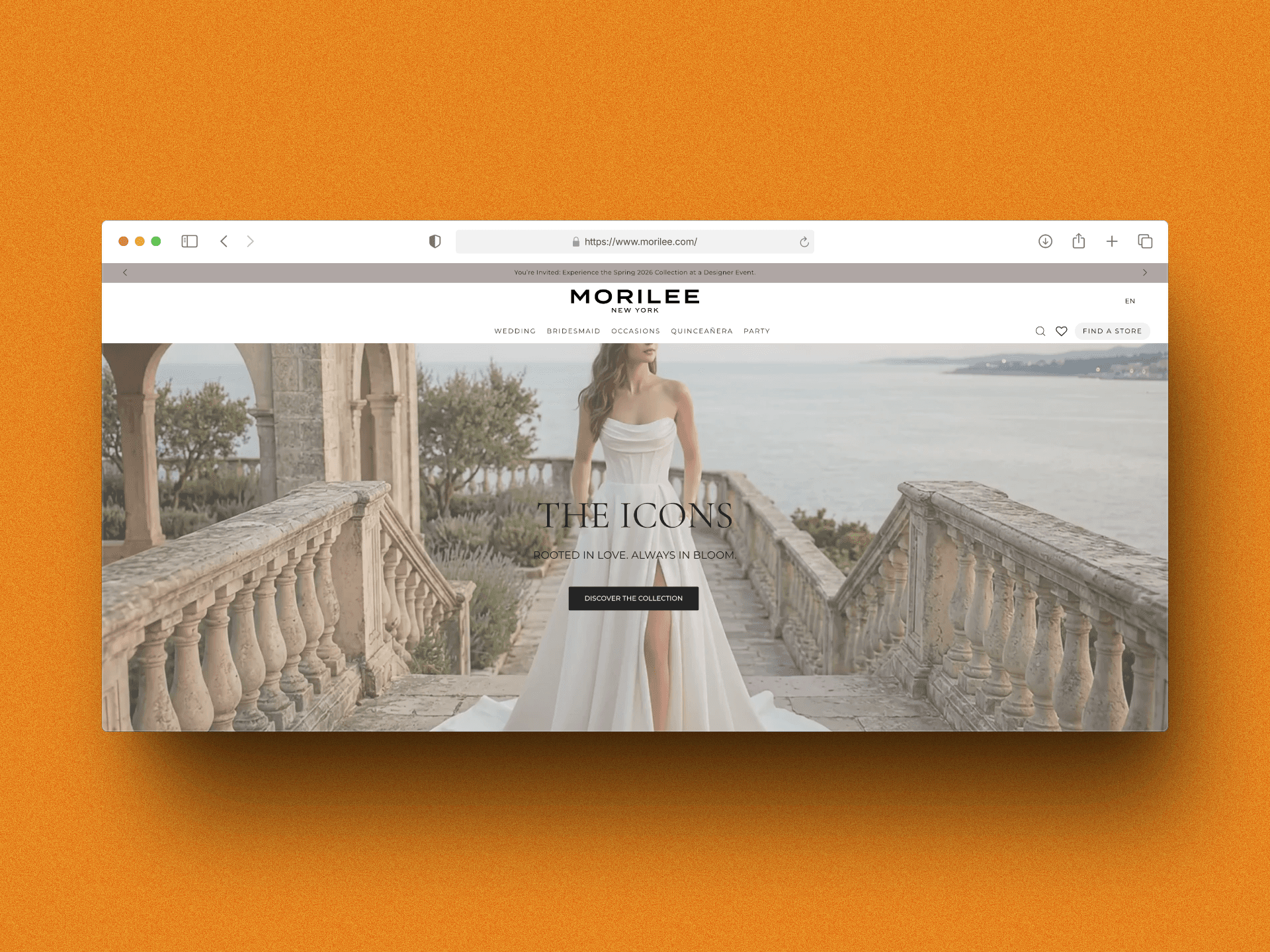
A full digital rebuild for one of bridal fashion's heritage names. New collection architecture, editorial-quality design, and a store locator flow that tripled in-store referrals — shipped in eight weeks without touching their existing WMS.
Morilee has been dressing brides for over 75 years. Their gowns are in boutiques across 100+ countries. Their website, however, hadn't kept pace — slow page loads, a collection architecture that confused visitors, and a mobile experience that dropped off a cliff after the homepage. The store locator, which drives significant real-world revenue, had a completion rate under 20%.
The brief: rebuild morilee.com from the ground up. Keep the WMS and inventory feeds untouched. Deliver editorial-quality design that does the gowns justice. Launch before the autumn bridal market season.
Problems
FourThingsBreakingtheExperience.
Performance cliff
LCP of 8.2 seconds on mobile. Every editorial hero image was a full uncompressed JPEG. Bounce rates mirrored it — over 68% on product pages.
Collection sprawl
Bridal, Prom, Evening, Mlny, Party — five taxonomies with no unified nav logic. Users searching for a sub-brand were three clicks deep before finding anything.
Dead store locator
The existing “Find a Store” flow had no auto-location, no filtering by collection, and required a full page reload for each search. 80% of users abandoned it.
Editorial disconnect
Lookbook assets existed but weren't surfaced. Designer Events were buried in a calendar with no geographic filtering — useless for the brides they were targeting.
Approach
PerformanceFirst,ThenEditorial.
The design and build ran in two overlapping tracks. Track one was pure engineering: Next.js 15 App Router, Sanity CMS for editorial content, Algolia for collection and store search. Track two was visual: a design language built around the gowns themselves — restrained typography, full-bleed photography, and a colour palette pulled from ivory and candlelight.
Week 1–2 — Architecture & content model Audited all five collections and mapped a unified taxonomy. Built the Sanity schema and connected the existing WMS feed via a read-only API adapter — zero changes to their warehouse logic.
Week 3–4 — Design system Typography: Cormorant Garamond for editorial headings, DM Sans for UI. Colour tokens: Ivory, Champagne, Deep Noir. Component library in Figma before a single line of production code.
Week 5–6 — Collection pages & search ISR for collection pages — stale-while-revalidate at 60s. Algolia instant search with filters for silhouette, colour, length, and sub-brand. Sub-100ms query latency in production.
Week 7 — Store locator & events Auto-detect location via browser API, Mapbox GL for the map, filter by collection availability. Designer Events calendar with geo-filtering and email reminders via Resend.
Week 8 — Performance hardening & launch Image pipeline via Sanity's CDN with srcset and blur placeholders. LCP under 1.5s on 4G mobile. Full UAT with their merchandising team, then live on a Tuesday morning.
Key Screens
ThreeScreensThatChangedtheNumbers.
Each screen targeted a specific failure in the original site — editorial presence, collection discoverability, and store locator completion.
Collection browsing: editorial grid with faceted filtering
The collection pages were rebuilt around the photography — full-bleed hero with a two-column gown grid beneath. Algolia instant search with silhouette, colour, length, and sub-brand filters. Sub-100ms query latency in production. ISR at 60s keeps pages fast while staying within the WMS nightly sync cadence.
Store locator: auto-detect, collection filter, Mapbox GL
The original store locator had an 80% abandonment rate. The rebuild introduced browser-based auto-location, per-collection filtering (“show only stockists carrying Bridal”), and a Mapbox GL map styled to match the cream-and-ivory UI. Completion went from 20% to 71% within 30 days.
Designer Events: geo-filtered with email reminders
Designer Events were previously buried in a flat calendar with no location context. The rebuilt Events page surfaces upcoming trunk shows and designer appearances with geographic filtering, a map view, and Resend-powered email reminders — so brides discover relevant events instead of missing them.
Measured at 30 days post-launch against the same 30-day window the prior year. The performance improvements cascaded: faster pages meant lower bounce, lower bounce meant more collection exploration, more exploration meant more store locator usage.
LCP on 4G mobile (was 8.2s)
1.4s
Mobile conversion vs. prior year
+41%
Store locator completions
3.5×
Bounce rate across collections
−29%
Decisions
CallsWorthExplaining.
Why Sanity over a custom CMS or Contentful?
Morilee's merchandising team edits content daily across collections, lookbooks, and events. Sanity's Portable Text and custom input components let us build editorial workflows that matched how the team already worked — not the other way around. The image pipeline with hotspot/crop built-in was the deciding factor for an image-heavy site.
Benefit: Better editorial DX
Benefit: Image hotspot/crop built-in
ISR at 60s — why not real-time?
Collection inventory only updates via nightly WMS sync. Real-time revalidation would have added streaming infrastructure cost with zero user benefit. 60s ISR gives a snappy cached response on every request while staying within the update cadence of the source data.
Benefit: Zero latency for users
Trade-off: Possible 60s stale reads
Mapbox GL over Google Maps?
Custom map styling was non-negotiable — the editorial tone required a muted, desaturated map that wouldn't fight the cream-and-ivory UI. Mapbox GL supports full style customisation via JSON; Google Maps styling is limited and the custom map JSON API is deprecated.
Benefit: Full style control
Trade-off: Higher tile cost at scale
Learnings
WhatI'dDoDifferently.
Would change: Start with the store locator
The store locator was scoped as a week-7 feature, but in retrospect it was the highest-value page on the site. Starting it in week 3 would have allowed more time for the inventory-filter integration that had to be cut for launch.
Would change: Decouple content model earlier
The Sanity schema evolved three times during the build as we learned how the merchandising team actually wrote product copy. Spending one extra day on content model workshops at the start would have saved a week of migration work mid-project.
Would change: Ship a perf budget in the brief
LCP targets weren't formalised until week 5 when design handed over assets. Adding a performance budget to the initial proposal — max image file sizes, target LCP, no client-side fonts above the fold — prevents late-stage scrambles.
Would keep: Mux for video — day-one decision
Several collection pages wanted looping video backgrounds. Sanity's video upload is not a CDN — we ended up piping through Mux two days before launch. Next project, Mux is scoped from the brief if video is anywhere on the requirements list.
We've been in bridal for 75 years and this is the first time our website actually reflects the quality of our gowns.