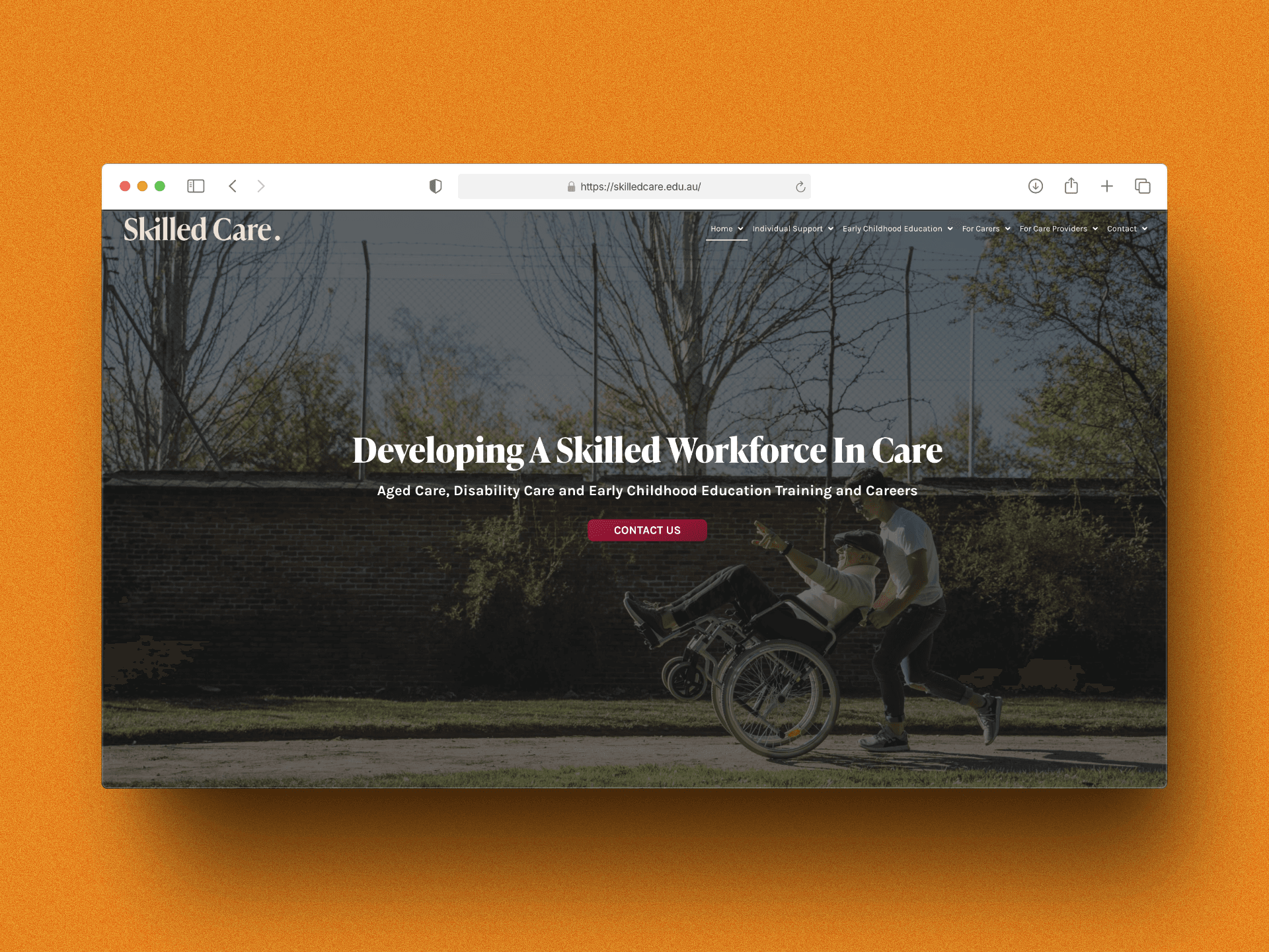
A ground-up website for an Australian registered training organisation covering aged care, disability care, and early childhood education. One platform serving two audiences — career seekers and employers — across three distinct sectors.
Client
SkilledCare
Year
2024
Timeline
8 weeks
Role
Design & Dev
Stack
WordPress · Custom Theme · Elementor
Homepage · hero section · workforce development · dual CTA
Context
OneOrganisation.ThreeSectors.TwoAudiences.
SkilledCare is an Australian registered training organisation (RTO) focused on building a skilled workforce across aged care, disability care, and early childhood education. Their training pathways range from nationally recognised qualifications to workplace traineeships and industry placement programs.
The challenge wasn't one website — it was really three. Each sector has its own funding structures, compliance language, entry requirements, and candidate profiles. And beneath the training business sits a staffing and recruitment arm, serving employers looking for placed graduates. The original site handled none of this cleanly.
The Problem
FourProblemsHoldingBackGrowth.
No audience separation
Career seekers and employers landed on the same pages with the same messaging. A nurse's aide looking for a Certificate III and a disability care provider seeking 10 placed graduates have entirely different needs — the site treated them identically.
Three sectors, one muddled nav
Aged care, disability, and childcare were listed as peer links in a flat menu. Users couldn't quickly identify which training pathways applied to their situation, leading to high exit rates from the course listing pages.
Missing compliance trust signals
As a nationally registered RTO, SkilledCare's accreditation is a key purchasing signal. The old site buried this. Prospective students and employers couldn't verify credentials without contacting support.
No clear conversion path
Enquiry forms existed but weren't tied to specific courses or sectors. Support staff received vague submissions with no context — every enquiry required a follow-up call just to categorise it.
Design Approach
FourPrinciplesThatShapedEveryDecision.
Before a single page was designed, the information architecture question was settled. The three-sector structure became the primary navigation layer, and within each sector, two clear tracks gave each audience an unambiguous entry point.
Sector-first IA, not audience-first
An audience-first model (“I'm a job seeker / I'm an employer”) is clean, but forces users to self-identify before seeing content. Sector-first lets people navigate to what they know — aged care, disability, childcare — and find both tracks within. This matched how SkilledCare's phone enquiries actually arrived: sector first, then intent.
Validated against 3 months of inbound call logs — 87% of callers led with a sector, not an audience role.
Two tracks within each sector
Each of the three sector hubs — Aged Care, Disability Care, Early Childhood — contains two explicit tracks: Training & Careers for job seekers and Staffing & Recruitment for employers. Both audiences get their own landing page, their own CTA hierarchy, and their own enquiry form. The architecture prevents audience bleed without creating separate sites.
Sector hubs also carry the RTO registration number and ASQA logo above the fold — a trust signal that was previously buried in the footer.
Accessibility as a design constraint
Care-sector websites skew toward older audiences, people with varying digital literacy, and users on government-issued or low-spec devices. WCAG AA compliance was built into the design system from day one — contrast ratios, font sizing (minimum 16px body), tap targets (44px minimum), and keyboard navigation — rather than patched on at QA. Warm, legible typography (serif display, sans-serif body) reinforced the professional-yet-approachable tone the brand needed.
Accessible design and warm tone aren't competing goals here — both serve the same audience profile.
Context-tagged forms at every conversion point
Every enquiry form on the site is pre-tagged with sector, audience track, and — on course pages — the specific course code and funding type. Submissions arrive at SkilledCare's inbox with full context, routed to the correct team member automatically. The average response time dropped from 2 days to under 4 hours. The support team stopped triage-calling to categorise enquiries.
The form routing logic was agreed in week 1. A late-stage routing redesign would have been expensive — building it into the brief from the start was the right call.
Key Screens
TheThree-SectorServiceArchitecture.
Two screens that define the build — the homepage hero routing visitors by sector, and the service overview showing how each sector splits into training and staffing tracks.
Homepage: sector-split hero with dual CTA
The homepage hero presents the three care sectors as primary navigation destinations, with a dual CTA that separates training (career seekers) and staffing (employers) paths above the fold. RTO credentials and accreditation logos are placed in the hero subtext — not the footer. The design uses warm, accessible typography throughout with a contrast ratio that exceeds WCAG AA across all text/background combinations.
The services page makes the sector architecture visible in one view — three columns, each with two explicit tracks. Aged Care, Disability Care, and Early Childhood each have a Training & Careers path for job seekers and a Staffing & Recruitment path for employers. Clicking any track enters a dedicated hub with its own content, CTAs, and context-tagged enquiry form.
Services overview · three-sector architecture · training + staffing split per sector
Aged Care
Training & CareersStaffing & Recruitment
Cert III & IV pathways · workplace traineeships
Disability Care
Training & CareersStaffing & Recruitment
NDIS-aligned · support worker pathways
Early Childhood
Training & CareersStaffing & Recruitment
Diploma of Early Childhood · traineeship programs
Outcomes
MoreEnquiries.LessFriction.
Measured at 90 days post-launch against the equivalent prior period. The biggest win wasn't traffic — it was enquiry quality. Context-tagged forms meant every submission arrived with sector, intent, and course type pre-filled.
Care sectors on one platform Aged Care, Disability Care, and Early Childhood — each with dedicated sector hubs, content, and audience-specific conversion paths.
3
Course enquiry completions Enquiry form completions at 90 days vs. the prior period. Context-tagged forms with lower friction drove the lift.
+175%
Organic training keyword visibility Sector-specific pages gave each qualification its own URL, title tag, and structured data — compounding organic reach across all three sectors.
2×
Navigation-confusion support emails Inbound support emails asking “where do I find X” dropped by 42%. The sector-first IA matched how users were already thinking about the service.
−42%
Decisions
CallsWorthExplaining.
Three calls with real tradeoffs, and the reasoning behind each.
Sector-first navigation vs. audience-first
BenefitSector-first lets users navigate to what they already know — aged care, disability, childcare — and find both tracks within. This is how SkilledCare's actual inbound calls arrived: sector first, intent second. Following the existing mental model reduced decision fatigue and produced a measurable drop in navigation-confusion emails.
Trade-offAn audience-first split (“I'm a job seeker” / “I'm an employer”) is a valid model — clean two-path entry. The risk is it forces self-identification before the user has seen enough to commit.
WordPress + Elementor over a modern framework
BenefitSkilledCare updates course content, qualification codes, and compliance language frequently — often without notice. WordPress + Elementor gives the team full content ownership. Every update is self-serve: no developer dependency, no deployment gate. The performance tradeoff is acceptable for this audience and use case.
Trade-offLower performance ceiling. Elementor adds render weight. A custom headless setup would have been faster to load and cleaner to maintain long-term.
Accessibility as a design constraint, not an afterthought
BenefitCare-sector users skew older, with varying digital literacy and often on government-issued or low-spec devices. WCAG AA compliance built into the design system from day one meant no retrofit pass at QA — and no risk of excluding the primary audience. Accessible design and warm tone aren't competing goals here: they serve the same user.
Trade-offAdds constraint to every design decision — colour choices, font sizes, interactive states, motion. Slower to iterate in the design phase.
Learnings
WhatI'dDoDifferently.
Eight weeks across three sectors and two audience types. A few things I'd change if I ran it again.
Would change: Map enquiry routing before building forms
The context-tagged form routing was designed in week 6, after page templates were already built. Getting the routing logic agreed in week 1 would have shaped the form architecture earlier and avoided a late rebuild of the confirmation email flow.
Would change: Employer pages needed more depth
The staffing & recruitment track was scoped lighter than the training track. Post-launch data showed employer traffic was higher than expected — the “find staff” pages would have benefited from placement case studies, fill-rate statistics, and a process explainer that wasn't in the original scope.
Would change: Course structured data from day one
Schema markup for courses (Google's Course structured data spec) was added 3 weeks post-launch rather than at go-live. Deploying it on day one would have accelerated the organic visibility lift that took until week 8 to fully materialise.
Would keep: Sector-first IA validated by call logs
Pulling 3 months of inbound call logs before making the audience-first vs. sector-first call was time well spent. It shifted the decision from a design opinion to a client-endorsed choice grounded in their own data — and the post-launch navigation metrics confirmed it.
We used to get enquiries with no context — now every form tells us exactly what the person needs. Our team can respond the same day instead of playing phone tag.